What is plot() in R?
plot() in R is a versatile function that supports various kinds of charts including scatter plots, line and bar graphs, histograms, box plots and more.
How does plot() in R work?
The plot() function in R is used to make charts. It places data points on a coordinate plane and connects them with each other or marks them in different ways. That allows you to illustrate patterns and relationships in data and better identify trends or deviations.
plot() can make scatter plots, line and bar graphs, histograms and many other types of graphs. Thanks to its versatility, it’s used for data visualization in a variety of contexts, ranging from data analysis to presenting results. Its user-friendliness and flexibility make it an important tool for anyone analyzing data, working with statistics or looking to illustrate complex data sets.
What is the syntax of plot() in R?
The structure of the plot() function in R contains arguments for x- and y-axis data and optional arguments for customizing the appearance of the graphic, including colors, axis labels and chart types.
The basic syntax looks as follows:
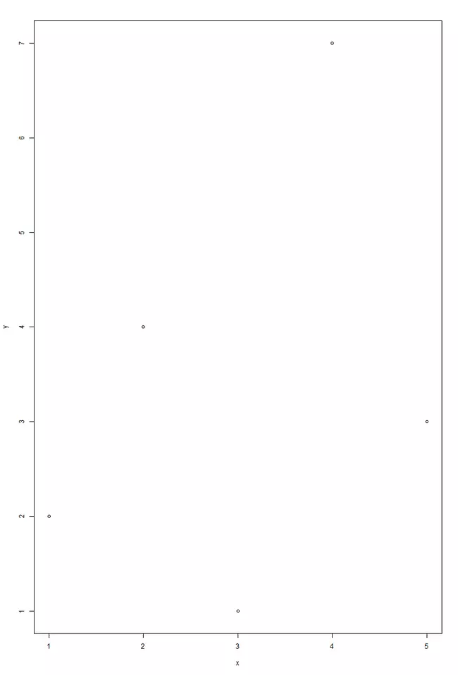
plot(x, y, ...)In the following example, we plot the values from the vectors x and y on a scatter plot. The plot() function uses default values for the graph type, colors and axis labels since these arguments have been left unfilled.
x <- c(1, 2, 3, 4, 5)
y <- c(2, 4, 1, 7, 3)
plot(x, y)The resulting graph looks like this:

How to customize graphs with R plot()
You can customize the graph type and how it looks with further arguments in the plot() function in R.
How to create a sequence of points
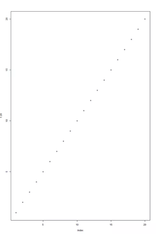
You can easily create a sequence of points along the x- and y-axis using the : operator.
plot(1:20)The graph will look as follows:

As we can see, plot(1:20) creates a simple scatter plot where both the x-axis and the y-axis are automatically filled with the values 1 to 20.
How to draw a line
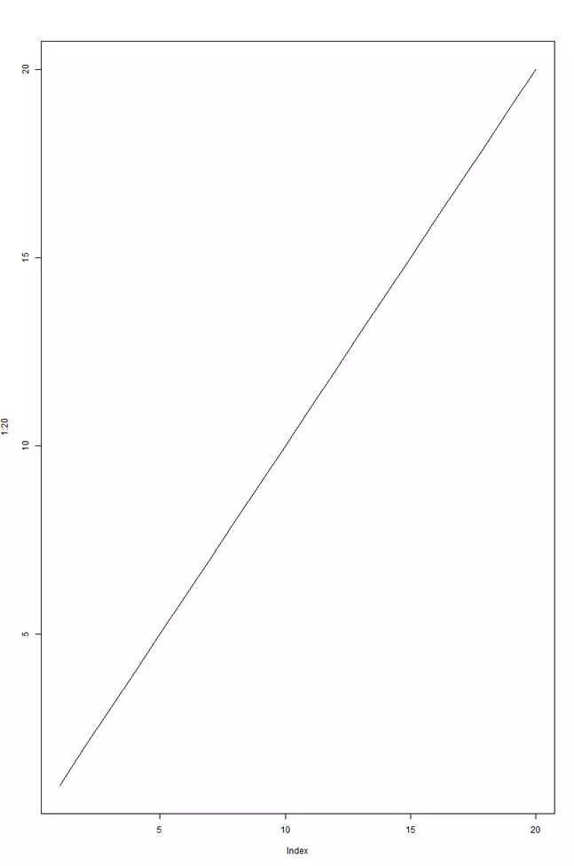
If you’d like to have a line graph rather than a scatter plot, simply enter type=l as an argument. This defines the graph type as “Line”.
plot(1:20, type="l")A line will then be drawn between the points.

How to specify labels
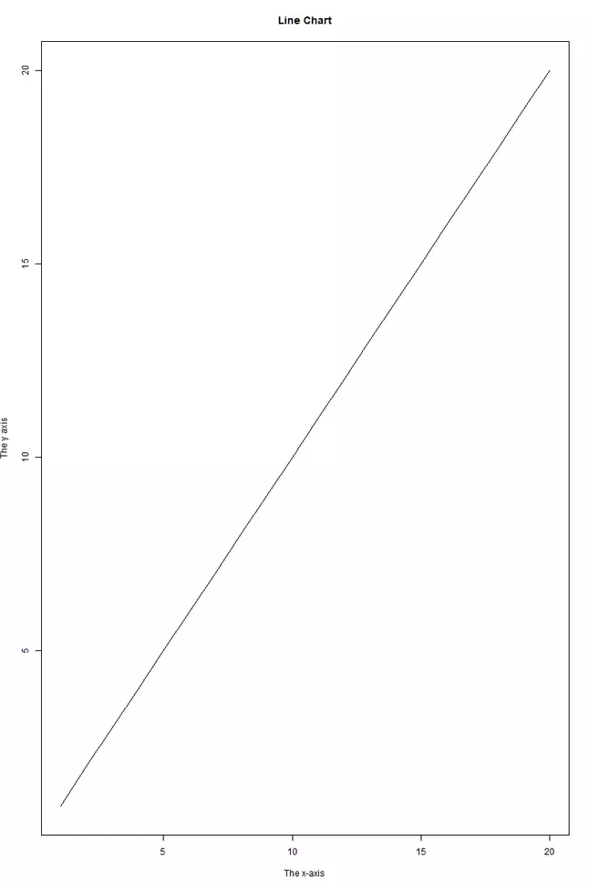
You can add labels to the chart with the parameters main, xlab and ylab.
plot(1:20, type="l", main="Line Chart", xlab="The x-axis", ylab="The y axis")The result looks as follows:

How to change the graph’s appearance
Let’s now look at a more complex example, where we change the color, size and shape of the points on the graph.
plot(1:20, type = "p", col = "green", pch = 8, cex = 1.5, main = "Scatterplot", xlab = "The x-axis", ylab = "The y-axis")The resulting graph looks as follows:

type = "p": Sets the plot type as “points”col = "green": Sets the color as greenpch = 8: Sets the symbol for the pointscex = 1.5: Sets the size of the points as 1.5 times larger than standard- `main = “Scatterplot”: Sets “Scatterplot” as the title of the graph
xlab = "The x-axis"andylab = "The y-axis": Adds labels to the x- and y-axis
You can modify these parameters as much as you want to get a graphic that fits your needs.
You can also learn how to work with strings in our Digital Guide. Take a look at the tutorials for R substring() and R gsub() and sub().
- Stay online with 99.99% uptime and robust security
- Add performance with a click as traffic grows
- Includes free domain, SSL, email, and 24/7 support

