How to create a histogram in Excel
Although they look just like normal bar graphs, histograms are used to show the frequency distribution of data. While you can do this with a mathematical formula, Excel offers a straightforward tool for creating histograms. In this article, we’ll explain how to make a histogram in Excel.
- Store, share, and edit data easily
- Backed up and highly secure
- Sync with all devices
How to make a histogram in Excel quick guide
- Select the data in your Excel document that to create a histogram from.
- Click on Insert, then on the bar chart symbol and select Histogram.
- A histogram will now be generated in your Excel worksheet.
What are histograms?
Histograms provide a visual summary of frequency distributions, which is why this kind of chart is mainly used in statistics. With the appropriate graphics, it’s possible to read how often certain values appear in one bin (a group of values). Here, both the width and the height of the bars play a role. The size of a bin can be read from the width of the bar – and this is one of the advantages of a histogram. When you create this kind of chart, you can independently set the size of the bin.
You can decide how many bins to include and how wide to make them. It’s important to choose values that allow the chart to transmit meaningful information.
How to make a histogram in Excel step by step
Excel doesn’t take all the work off your hands when creating a histogram, but it can save you a lot of time. The instructions shown here apply to Excel versions from Office 2016 onwards and Microsoft 365.
Histograms as a chart type
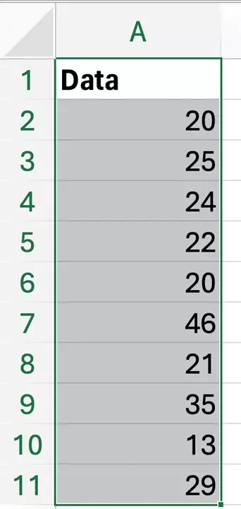
Excel also recognizes histograms as a chart type. With this function, you have different options for classifying classes. To be able to use the options when creating a histogram in Excel, you need to use the list containing the original measurement data. The first step is to select the data you want to use.
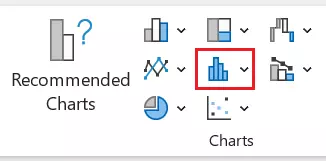
Now click on the button for the histogram in the Insert tab (in the Charts section).
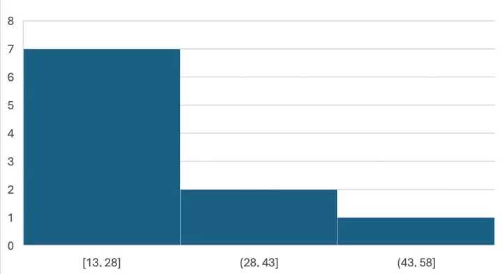
Based on the data you provide, Excel automatically creates categories. Excel evenly distributes the data into different bars.
If you right-click on the X-axis and then select the Format axis… option, you’ll be given advanced axis options.
In addition to creating a histogram, you can also follow the steps above to create other charts in Excel as well. When it comes time to select a chart type, simply choose the one you want Excel to create.
Apart from the automatic classification that the program performs, Excel also offers you two other interesting possibilities. You can define the class width (bin width), and Excel will then determine how many classes need to be created or you can specify how many classes you want, and Excel will automatically determine the width of the bars. Additionally, you can also set overflow and underflow bins. These are classes that more precisely define the edges of the histogram. Enter values that you consider to be the desired minimum and maximum values – that is, “everything below this value” and “everything above this value”. Depending on the collected values, you can make a more meaningful classification.
How to create an Excel histogram using add-ins
You can use an add-in, i.e., an extension of the standard functions, to create Excel histograms. To do this, you need the Analysis ToolPak. You can activate this add-in (or check whether it is already active) by going to the Add-ins section in the Excel Options menu.
If the add-in is activated, make a table with all your measurement data in one column and your chosen bins in a second one. For the latter, enter an “up to” value. If you’d like to integrate all values from 30 to 34 into one bin, then create a 29 bin and a 34 bin. Everything smaller than 30 will fall into the first bin, and everything that’s larger will fall into a third bin.
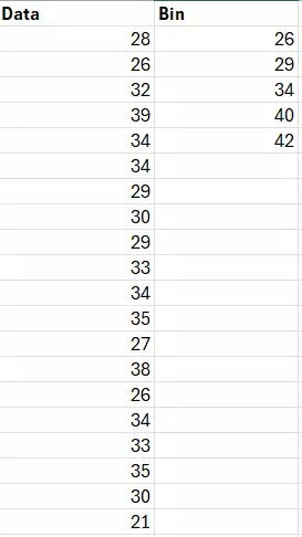
Now use the add-in to select the bin frequency. Go to the tab Data and click on the button Data Analysis. From the list that opens, select the option Histogram. At this point, Excel will provide you with an input field. For Input Range, select the column containing the measurement data. The Bin Range is the area where you’ve defined the bins. If you’ve labeled the columns in the first line, activate the option Labels.

After you’ve decided where the analysis of the data is to be displayed (in a new or an existing spreadsheet), Excel will create a frequency analysis for you. In the new table you can now read how much data appears in the respective bins. In order to create the actual histogram, you have to activate the option Chart Output. After you do this, click OK and Excel will create the chart.
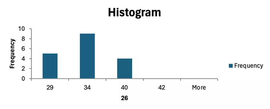
Using this method, you can only create histograms in Excel with identical bin intervals – that is, bars with the same width. It’s not possible to correctly display an uneven distribution of widths with this method.

