Professional e-mail signatures
E-mail signatures are a fundamental part of business communication. Special information placed at the end of a message makes it possible for recipients to identify the sender and facilitates steps in establishing contact. While signatures for private messages are exclusively voluntary, it’s widely considered to be good practice, and in some cases even obligatory.
How should e-mail signatures look?
Good e-mail signatures contain all the most important contact information and are kept in a short, compact form that recipients can easily read. They should also aim to leave behind some sort of impression of the sender; incorporating logos into your signature is also useful, as it complements existing branding efforts.
Private Signatures
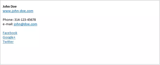
E-mails that aren’t legally binding can still serve a valuable purpose by making their readers aware of alternative contact channels or other projects, like websites. A good e-mail signature generally features the following:
- First name and last name
- Landline or cellphone number
- E-mail address
- Website URL
- Links to profiles on social media networks
And while additional elements like quotes, mottos, or graphics may be popular, they should always be used sparingly and should keep your recipients in mind. What may impress your friends and family, might come off as irritating when incorporated into e-mails for job applications or other official purposes. Adhering to the following points will help keep you on the right track:
- Company name, including its listed legal status
- Valid company address
- Professional title or position from place of employment
Professional e-mail signatures are also excellent locations for optional content, such as claims, slogans as well as information on relevant discounts or sales. Careful consideration is required for such use, as recipients first and foremost expect fluid communication during e-mail correspondence and don’t want to be bombarded with too many ads. Sharing relevant company news or announcing dates of absence is another very helpful use of this function.
Disclaimers can also be valuable tools for informing users on the legal standing of the respective e-mail’s content. A common example reads as follows:
‘This e-mail may contain confidential and/or privileged information. If you are not the intended recipient of this e-mail, you are hereby notified that saving, distribution or use of the content of this e-mail in any way is prohibited. If you have received this e-mail in error, please notify the sender and delete the e-mail.’
As official as such e-mails may sound, it’s important to note that they carry no real legal bearing.
How should an e-mail signature look ?
A good e-mail signature should be clearly structured, legible, and should also leave a professional impression on its recipients. That’s why it is recommended to incorporate a modest design that structures information well.
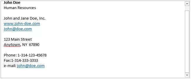
The following examples shows a signature containing all the most important features of a solid e-mail signature. This version, however, is much more difficult to read:
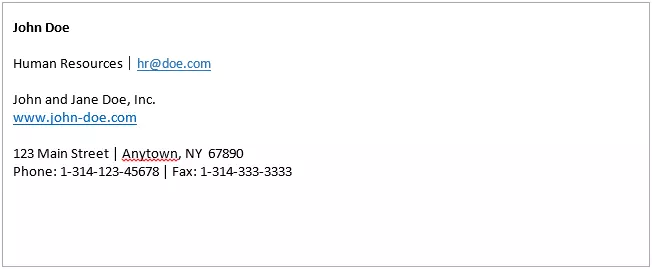
Indenting the signature into multiple paragraphs is one way of making this signature more legible. Separating distinct bits of information can also be done by using vertical bars. Conventional e-mail programs generally provide enough space for signatures so that no problems occur when additional spacing is used.
E-Mail signatures designed according to this style are structured as the following example shows:
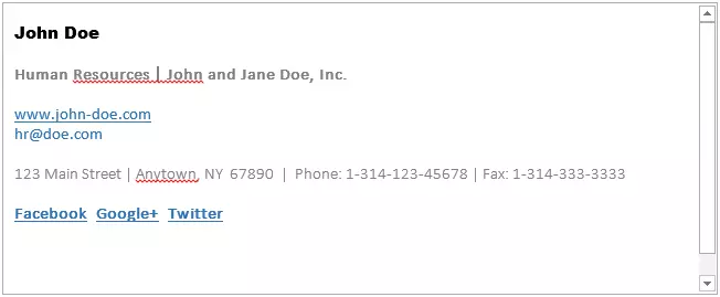
The right dose of different fonts as well the use of various colors and sizes can significantly increase an e-mail signature’s legibility. The human eye reacts to contrasts, and when correctly used, this type of formatting can help highlight different parts of an e-mail signature. The rule to follow here is simple: less is more. It should also be noted that formatted e-mail signatures can be set up in either Rich Text Format or as an HTML message. In contrast to full text signatures, formatted messages carry the risk of being unreadable to other e-mail programs. For this reason, newly drafted signatures should be tested using multiple applications before they are fully adopted.
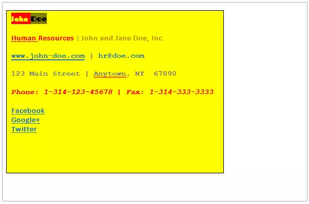
In order to maintain a professional image, it’s best to only use modest colors and employ no more than two different fonts. Acting otherwise doesn’t only damage an e-mail signature’s legibility; such bold creations can quickly appear cluttered and look unprofessional. And while it may sometimes be justified to incorporate company colors, the following example should be avoided as best as possible when developing a solid e-mail signature:
Optional design elements
Many companies add graphics or company logos to their e-mail signatures in order to increase their recognition. Featuring a photo of the sender has the added advantage of giving your message a more personal touch. Not all recipients appreciate this extra effort, however. Keep in mind that e-mail programs also have their difficulties: thanks to HTML, messages with picture elements can be attractively designed; these, however, are often displayed incorrectly or filtered out as spam. Even when correctly interpreted, such e-mails still have the potential to irritate their recipients. This is due to the attached picture, which increases the data load and eats away at storage.


